On Sunday, November 3, from 7-9pm, Stephen Rynerson will lead a talk on "Historically Appropriate Additions & Alterations to Period Structures" for the Alameda Architectural Preservation Society. See the flyer above for more details.
Thursday, October 10, 2013
Monday, April 1, 2013
Homage to A. W. Pattiani
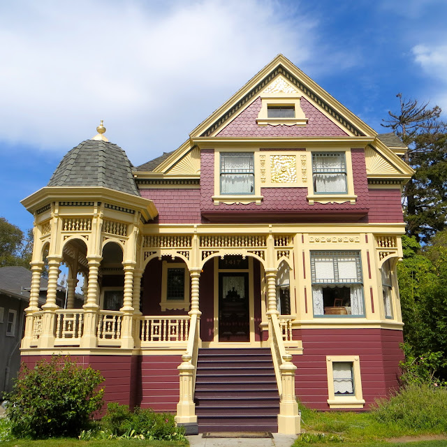
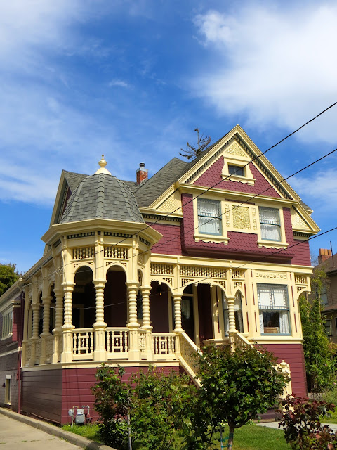
This building is one of several remaining A.W. Pattiani houses in Alameda and Berkeley. The house had been significantly altered by additions and expansions on its west and north elevations, by the removal of original ornament and by the application of wood shingles over original wood siding and previously ornamented surfaces. The west addition included a wraparound porch where none previously existed, covered by a squat, glass-roofed pergola supported on classical style columns. The result of the cumulative changes was a house that was no longer recognizable as an A.W. Pattiani Queen Anne.
The current owners wanted to restore the character of A.W. Pattiani’s original design as well as specific Pattiani signature ornamental details to the property. They also needed to address serious water intrusion problems and the ensuing damage that had developed on the wraparound porch. It was not practical for the owners to consider giving up the previous western addition (which contains a dining room) and wraparound porch, but both additions were ornamentally inconsistent with the original design and created massing challenges to restoring the main facade.
The solution to this dilemma was to restore the original portion of the structure as closely as possible based on existing Pattiani examples and historical photos, and to rebuild the deteriorated wraparound porch using a vocabulary more compatible with the original house. This included adding a cupola that effectively conceals the awkward western addition while adding new ornament and massing in proportion to the original façade.
Several months of painstaking structural work and ornamental
carpentry were followed by a thorough paint job based in part on original
colors exposed when shingles were removed. The new color design substantially
reinforces the massing and ornamentation of the house exterior. The new porch
conceals a steel moment frame that adds seismic stability to the structure, and
porch and stair railings have been designed to comply with modern life and
safety codes.
Friday, March 15, 2013
2013 Palladio Award Recipient for Design of the McDonald Mansion
Rynerson O'Brien Architecture (ROBA) of Oakland, and Paul Duchscherer, Historical Design Consultant of San Francisco, are pleased to announce that they have been chosen to receive a 2013 Palladio Award for the design of “Mableton” (also known as the McDonald Mansion), in Santa Rosa, California.
The 12th Annual Palladio Awards recognized 11 architectural
firms nationally for excellence in traditional design. ROBA and Mr. Duchscherer won in the
Residential Architecture Restoration and Renovation category of the awards for
their work on Mableton, a significant historic landmark built in 1879 by
prominent local developer Mark L. McDonald as the showplace of his “McDonald’s
Addition”, now Santa Rosa’s McDonald Historic District. The Palladio Awards are
sponsored by Period Homes and Traditional Building magazines, which are
published by Restore Media, L.L.C..
Mableton, a comprehensive five-year project that was completed in June
of 2011, will receive full-color editorial coverage in the July issue of Period
Homes magazine.
Monday, February 4, 2013
The McDonald Mansion's Formal Rooms
Main Hall
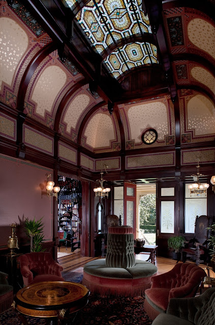
With its central leaded art glass laylight arching above multi-ribbed,
coved panels, the new ceiling treatment has restored the Main Hall’s original
proportions. The upper part of the room, previously opened up to the roof (see
previous image), now houses a daylight-enhancing plenum enclosure, with a
perimeter catwalk and HVAC equipment. The open second floor hallways that had
overlooked the Main Hall now borrow daylight from the central plenum space through
new art glass windows. Accessed via the Library’s cast iron spiral staircase, an
entirely new mezzanine-level room (the Map Room) was carved out of the vertical
space above the front doors to the roof, and overlooks the Main Hall through a
pivoting bull’s-eye window. As the dominant hub of the formal rooms, the new
Main Hall design sets the tone for the surrounding public spaces, with its bold
structure of Eastlake-style mahogany woodwork, and a strikingly panelized
assemblage of gold-tinged Aesthetic Movement wallpaper patterns.
Library
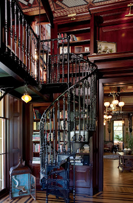
The Library’s sixteen foot ceilings, a typical feature of
Mableton’s formal rooms, allowed sufficient headroom to suspend a
glass-floored, period-style cast iron and steel catwalk to access the upper
bookcases, as well as the adjacent Map Room. To admit more daylight, the
floor-to-ceiling bookcases are splayed around the windows, and pairs of arching
iron brackets beneath the catwalk double as supports for art glass
lighting. Detailed in the Eastlake
taste, the mahogany mantel features fifteen vintage Minton tiles, each
depicting a Shakespearean play, and set within its own chamfered frame. Also
appropriate for a Library design of this era are the classical references in
the Neo-Grec style wallpapers, which enliven the panels of the beamed and
coffered ceiling.
Gentelmens' Parlor
The masculine connotations of the Gothic Revival style make
it an apt theme for the Gentlemens’ Parlor, which features an unusual oak
wainscot design adapted from a period example by noted English architect
William Burges. The large-scale
wallpaper adapts an 1880s pattern by William Morris that was first commissioned
for St. James’ Palace in London. The ceiling treatment is defined by a coffered
arrangement of chamfered beams, grained to match the room’s oak woodwork, and
enriched by a series of geometric, Gothic-inspired wallpaper panels and
borders. Seen through the wide pocket doors, the fireplace end of the Main Hall
is overhung by two (of four) matching bracket chandeliers that were custom made
for this project. Glimpsed beyond the Main Hall is the Ladies’ Parlor, which
completes this trio of interconnected living spaces.
Turkish Parlor
Reviving a period tradition of exotically decorated retreats
that were often called “smoking rooms”, the Turkish Parlor for Mableton, conceived
in the Moorish Revival-style, here takes the form of a domed octagonal pavilion,
set within a rectangular space. Comprised of stacked, rotated, and corbelled
octagons of graduating sizes, the dome rests on a delicate, ebonized oak framework
of pierced screens, lobed horseshoe arches, and slender columns that are
alternately free-standing and engaged to the walls. The small beveled mirrors
that ring the base of the dome help expand the space; below, larger opposing
mirrors are framed within the horseshoe arches. At the center of the dome, the
flat, deep blue “night sky”oculus crowns a Persian-inspired wallpaper ensemble,
and is the only visible surface that exposes the full height of the room’s
sixteen-foot ceiling. Recalling the similarly configured, original fir flooring
pattern of the Main Hall, the radial spider-web design of the new hardwood
floor mirrors the geometry and proportions of the dome.
Ladies' Parlor
French Revival styles, a frequent period choice for grander
homes, tended to have feminine connotations, and were often applied to “gender-specific”
rooms, such as Mableton’s Ladies’ Parlor. A bright southerly exposure and views
of the garden suggested greater daytime use for this room, and also prompted
the choice of its lighter, softer color scheme.
The previously flat sixteen-foot ceiling has been reconfigured into a
room-wide barrel vault, and embellished with a Neo-classical style wallpaper
treatment. Glazed and gilded painted finishes on the Louis XVI-style woodwork
complement the panelized wallpaper insets, with mirrors used to amplify the
light and views. This room retains its original “slip-head” windows (typical of
all the parlors), which retract into the upper walls like pocket doors, transforming
the windows into seven-foot-high doorway openings to the verandah.
Map Room
Overlooking both the Main Hall and the axial entrance
walkway, Mableton’s Map Room is a newly-created mezzanine-level room accessed
via the Library’s spiral stair and catwalk.
As the name implies, the room houses the owners’ collection of antique
maps, and the cartographic theme is reinforced by a stained glass compass rose
window designed and fabricated for the Map Room by Theodore Ellison Designs.
Directly opposite the compass rose window, a glass-floored steel observation
platform (not seen in this view) provides access to the three-part window
behind the curving bargeboard of Mableton’s main gable, and a pivoting
bulls-eye window below opens to the Main Hall.
The neo-grec wallpaper scheme of the Library expands into the three-part
ceiling and panelized walls of the Map Room which doubles as a private study.
Main Stair Hall
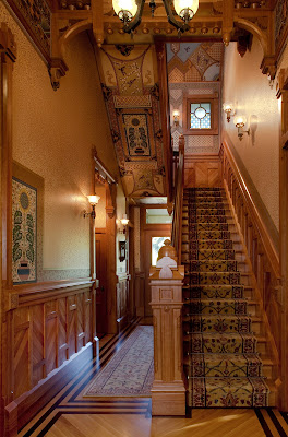
The new design of the Main Stair Hall interprets the
Anglo-Japanese mode of Aesthetic Movement taste, with repeating fan motifs and
linear outlines adapted from Mableton’s intact, original staircase railing. To visually
foreshorten the apparent length of the tall, narrow space, the ceiling was
divided into a sequence of square coved sections (part of one is seen here), divided
by ornamental wooden trusses, and fitted with compatible wallpaper elements and
accents. This view is taken from a ten-foot-wide pocket doorway to the Dining
Room; at right is one of two narrow pocket doors that flank the fireplace in
the Main Hall, and the doors behind the staircase lead to the verandah. Partly
visible at the stair landing is one of a matching suite of Japanesque leaded
art glass windows (including a laylight above the stairs) that was created for
this project.
Dining Room
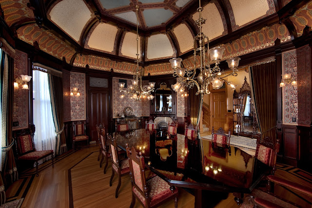
Mableton’s Dining Room, second in scale and importance only
to the Main Hall, is an elongated octagon in plan with a double-coved, ribbed
ceiling, and shares the Main Hall’s “Stick/Eastlake” design aesthetic. Situated on the Mansion’s central axis, the
Dining room features a three-sided outside wall overlooking the pool and
landscape elements that form the western terminus of that axis. Directly opposite the three-sided outdoor
wall is its interior counterpart that incorporates a built-in fireplace,
massive pocket doors and a built-in sideboard (not seen in this view). Dark
mahogany millwork frames wall, frieze and ceiling areas filled with gold and metallic
accented wallpapers inspired by the Victorian avant-garde designs of
Christopher Dresser. A dining set comfortably seats fourteen and is composed of antique and
reproduction chairs as well as a table custom built to the geometry of the
room.
Master Sitting Room
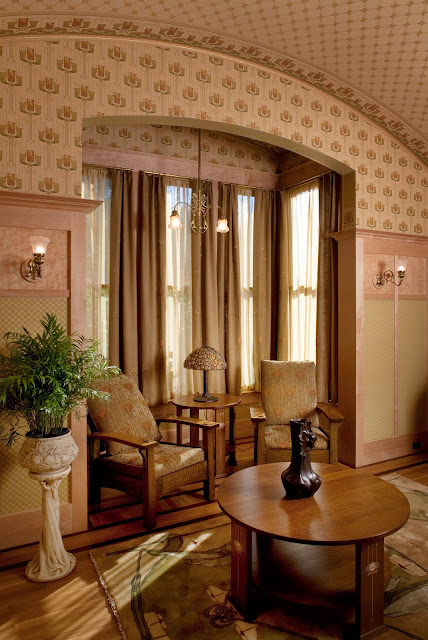
Mableton’s Master Sitting Room is part of a suite of rooms
that also includes the Master Bedroom and Master Bath that occupies one of two
new wings built at the rear of Mableton’s main floor. Subordinate in scale and subdued in palette,
this suite of rooms departs from the Victorian styles that characterize the
rest of Mableton’s interiors by introducing Arts and Crafts themes with
elements of Art Nouveau. These rooms are, by design, a quiet retreat enjoying a
favored location overlooking English landscape, parterre and pool garden
areas. The Master Sitting Room’s
interior includes a gently vaulted ceiling whose form is echoed in the arched
opening that frames the south-facing bay window. A tall maple wainscot with bird’s eye and densely
patterned wallpaper insets provides sets off the bold scale of the wallpaper
patterns on the upper walls and ceiling in this sunny interior.
All Photographs: Mark
Citret
Subscribe to:
Comments (Atom)


